 |
| UX Designer: Jared S. |
Project Overview
Responsibilities:
Researching the needs of the animal shelter, and the users of the website.
Create wireframes, mockups, and prototypes. And conduct user testing.
The product:
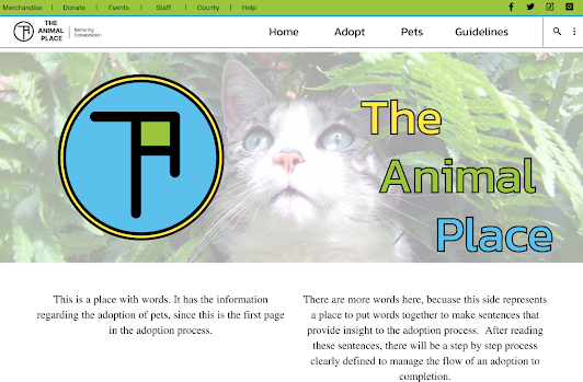
This is a website that the Animal Shelter will use to streamline the adoption process for their pets.
Project duration:
This project duration is from Oct. 3rd to Oct 21st
The problem:
The animal shelter is too busy and short staffed to meet the walk-in needs of an adoption services.
The goal:
We are designing a way for folks to adopt animals without bogging down the day to day activities
of the animal shelter.
Understanding the User
My empathy maps helped to clarify the fact that users need a simplified,
step by step process online to flow through the adoption process.
Previously, interactions with the animal shelter could take weeks sometimes through no fault
of their own.
There was a great need for providing information, and guidelines to those willing to adopt.
And the shelter needed a way to also verify if an adoption was a good fit for the pet.
Pain Points:
- Animal shelter is short staffed, cannot spend the time needed to educate and walk through adoption process with people.
- There was no clear step by step order to the adoption flow.
- Previous adoption methods were on paper only.
User Journey Map:

Working with the user journey "Betty" is on, the process for adopting a pet through traditional means is difficult to schedule time for information, and visitation with the pets to be adopted. As well, as gathering pertinent information from one place.

Starting the design


 The extra information that is seen on the webpage was not required on the smaller screen. So, I was able to include them in the footer on the android wireframe.


Study type:
Unmoderated usability study
Location:
United States, remote
Participants:
5 participants
Length:
20-30 minutes
- Two users discovered that there was no way to move backward in the flow, but couldn't access other pages in the flow process
- One user mentioned having need of larger images.
- Three users shed light on the idea that a ‘meet and greet’ could not be arranged.
Refining the design

Webflow:
Appflow:

- There was a user who was tested that had color accessibility requirements. They were able to complete adoption process.
- We were able to bring together the animal shelter and the local animal trainer for special need canines unit. Ultimately requiring an inclusion to the website (which was requested in the past.)
- Included in the developer notes is an additional software add for screen reader technology.
Going forward
the impact of your designs. In the real world, you’d include data like number of downloads or sign ups, but since this is a course project, you can include a positive quote from a peer
or study participant.
- This was a fictional project, that I will present to our local animal shelter.
- Lastly this application would be ready for front end development.
- I will test this iteration of the Hi-Fi prototype with users for deeper input.


